Friday, July 30, 2010

Upcoming Gmail Features

How many changes can you spot in this screenshot of an internal version of Gmail from the Chromium OS bug tracker?


Here's what I noticed: there are three links for "mail", "contacts" and "tasks" below Gmail's logo, there's a new button for composing messages, a "call phone" option in Gmail Chat, a drop-down for switching between Google accounts and the options that let you select unread or starred messages use less space.

{ Thanks, Mateo. }

Thursday, July 29, 2010

YouTube Increases Video Length Limit to 15 Minutes

YouTube decided to increase the video length limit from 10 minutes to 15 minutes. It may seem like a small change, but YouTube is testing the waters before dropping this limitation.

"Without question, the number one requested feature by our creators is to upload videos longer than 10 minutes. We've heard you, and today we're pleased to announce that we've increased the upload limit to 15 minutes," informs YouTube's blog.


The main reason why YouTube added a 10 minutes limitation back in 2006 was that a lot of users uploaded full-length movies and TV shows. Now that YouTube uses a content identification software and Viacom lost the case against YouTube, Google's video site can safely remove this arbitrary limitation. YouTube is cautious, so it will release incremental improvements.

"We've spent significant resources on creating and improving our state-of-the-art Content ID system and many other powerful tools for copyright owners. Now, all of the major U.S. movie studios, music labels and over 1,000 other global partners use Content ID to manage their content on YouTube. Because of the success of these ongoing technological efforts, we are able to increase the upload limit today," explains YouTube.

Find Blogs Using Google Blog Search

I remember that someone asked Matt Cutts if Google could restrict search results to homepages. He answered that it's a good suggestion, but adding [-inurl:html -inurl:htm] to your query works pretty well.

Now you can restrict Google results to homepages, but only if you're looking for blogs. Google Blog Search has always highlighted a small number of blogs related to your query and now you can find even more blogs by clicking on the "homepages" filter from Google's sidebar. Google's definitions of blogs is vague and it's likely that any site that offers feeds is included in Google Blog Search's index.

"We've updated Google Blogsearch to make it easier to find blogs that match your query, instead of just finding blog posts. The blogs tool on Google search results filters your results so you see only blog posts. We've added a homepages option that shows a full set of blogs related to your query," informs Jeremy Hylton in a Buzz post. Here are some examples: [tesla car], [google], [android].


{ spotted by François Beaufort. }

YouTube's Playlist Bar

YouTube started to show a persistent bar at the bottom of the page that shows the videos from the active playlist. For example, if you click on a video from your subscriptions, the bar lists other recent videos uploaded by your favorite users. Click on one of your favorite videos and the bar is populated with the rest of the videos. The bar is also useful if you add videos to the queue, a temporary playlist built dynamically.


Sterling, a reader of this blog who noticed the new bar, found an annoyance: "Even if the cursor isn't over the bar, it still pops up, so if you go rate a video, favorite or share it, as soon as you move near the bar, it pops up, blocking those settings, so you have to either scroll down or click on the bar to collapse it. It looks like the spot where the bar is triggered is just above where the video player ends when it's in shrink mode."

Once you collapse the bar, it no longer auto-expands, at least until you watch a new video. I couldn't find a setting that disables the bar or moves it to its original position.

{ Thanks, Sterling. }

Wednesday, July 28, 2010

More About Google's Experiments

A new Google paper gives more information about Google's experiments. Google tests many new features on a subset of users and that's the reason why you may see a different Google search interface, a new background color for Google ads or more Google search results.
At Google, experimentation is practically a mantra; we evaluate almost every change that potentially affects what our users experience. Such changes include not only obvious user-visible changes such as modifications to a user interface, but also more subtle changes such as different machine learning algorithms that might affect ranking or content selection. (...)

An experiment in web search diverts some subset of the incoming queries to an alternate processing path and potentially changes what is served to the user. (...) In addition to specifying how serving is changed via alternate parameter values, experiments must also specify what subset of traffic is diverted. One easy way to do experiment diversion is random traffic, which is effectively flipping a coin on every incoming query. One issue with random traffic experiment diversion is that if the experiment is a user-visible change (e.g., changing the background color), the queries from a single user may pop in and pop out of the experiment (e.g., toggle between yellow and pink), which can be disorienting. Thus, a common mechanism used in web experimentation is to use the cookie as the basis of diversion; cookies are used by web sites to track unique users. In reality, cookies are machine/browser specific and easily cleared; thus, while a cookie does not correspond to a user, it can be used to provide a consistent user experience over successive queries. For experiment diversion, we do not divert on individual cookies, but rather a cookie mod: given a numeric representation of a cookie, take that number modulo 1000, and all cookies whose mod equals 42, for example, would be grouped together for experiment diversion. Assuming cookie assignment is random, any cookie mod should be equivalent to any other cookie mod.

That's probably the reason why you can "opt-out" from an experiment by clearing Google cookies.

{ via SEO by the Sea }

A New Social Google Service?

There's a lot of speculation about a new Google service called "Google Me" that is supposed to compete with Facebook. Most likely, the service will expand the already existing profiles and activity streams, while adding support for social apps.

Wall Street Journal reports that Google has been in discussion with companies that develop social games for Facebook. "Google is in talks with several makers of popular online games as it seeks to develop a broader social-networking service that could compete with Facebook, according to people familiar with the matter."

Google's CEO, Eric Schmidt, said that "the world doesn't need a copy of the same thing", suggesting that Google won't try to imitate Facebook. It's clear that Google hasn't anticipated Facebook's success, placed losing bets and efforts like OpenSocial couldn't save Facebook's competitors from extinction.

Now that people spend a lot of time online using Facebook and find information filtered by their friends, even Google's search engine can become less useful. A lot of information is trapped inside Facebook: social connections, status messages, discussions and Google can't use most of the data to improve the relevance of search results.

Google has been more concerned with creating open standards for building social apps, for delivering real-time notifications, for public preferences, aggregating social graph data, but it didn't manage to build a coherent user experience that links all these pieces.

Monday, July 26, 2010

Google Punch

A video posted by Google shows the name of a new Google Docs feature: Google Punch. A "punch" is a Google Docs filetype, just like a document, a spreadsheet or a presentation.


Here's the video:


One of the definitions of the word "punch" is "an iced mixed drink usually containing alcohol and prepared for multiple servings; normally served in a punch bowl". Maybe Google Punch is a free-form document that lets you combine data from other documents, spreadsheets, presentations and forms. What do you think?

{ Thanks, Jeremy and Mark. }

Google's New Dictionary OneBox

Google added a new OneBox result for definitions. The OneBox uses data from Google Dictionary, shows pronunciation information, short definitions and links to other reference sites like Dictionary.com and Answers.com. Google shows the definition of an English word only if it's likely to be useful, so you'll usually see the OneBox when you search for obscure words or technical terms.


"We added implicit triggering, which means you can simply search for [flummox] and find the definition, you don't have to search for [define flummox] or [what is flummox]. We've also improved the definition result snippet to show more details such as parts of speech and pronunciation," explains Google.

Unfortunately, Google's new OneBox is redundant and inconsistent. If you type [salient] in Google's search box, Google Suggest already shows a definition of the word from Princeton's WordNet.


Search for [define salient] and Google shows a definition from WordNet, not from Google Dictionary.


Tip: to trigger the new OneBox when it's not displayed by default, add en:en to your query. For example, search for [en:en emulsion].

Sunday, July 25, 2010

A Strange Gmail Bug

Steven Schofield noticed a strange Gmail bug: attachments use more storage than they should.

For example, one of my Gmail accounts used 1567 MB of storage. I composed a new message, attached a file that had about 8.42 MB and saved it as a draft. Gmail's footer message was: "You are currently using 1590 MB (21%) of your 7479 MB." Gmail used 3 times more storage for my message and MIME encoding couldn't add so much overhead. I discarded the message and Gmail informed me I was using 1579 MB. After composing a message and deleting it, I lost about 12 MB.

I composed another message, attached the same file and sent it to an email address. Gmail used 23 MB to send a file that only had 8.42 MB. After deleting the message, I lost once again 12 MB of storage.

The most likely explanation is that Gmail's Flash uploader creates hidden messages for each file you upload. When Gmail launched the Flash uploader, these temporary messages were sent to the trash. Now they're probably no longer displayed.

Update (a day later): it's fixed. Google now shows the temporary messages from the trash.

Saturday, July 24, 2010

Play Snake in YouTube's Player

YouTube's player has a clever Easter egg: make sure the player has focus (try pausing and resuming the video), hold the left key for about 2 seconds and press the up key, while still holding the left key. You can now play Snake while watching the video.


This trick only works in YouTube's new player, which is only available for videos that don't include annotations or ads. It's limited to the videos played on YouTube's site and it doesn't work for embedded videos. Here's an example of video you can use to play Snake.

YouTube is not the only Google product that lets you play games. Gmail has a Labs feature called "old Snakey" that adds a Snake game inside Gmail.

{ via TheNextWeb. Thanks, Kevin. }

Google Chrome Canary Build

Google Chrome's team added a new releases channel for early adopters and developers: Canary builds. Unlike the beta channel and the dev channel, Canary builds can be installed without overwriting a regular Chrome build. That means you can install both a Canary build and a regular build that could be on the stable, beta or dev channel.

The Canary build is only available for Windows, it's "installed to a different path, gets updated separately, and runs side by side with an existing stable/beta/dev installation". Google says that the Canary build will usually be the same as the dev build. "Sometimes if necessary, we may push additional updates on Canary build so its version is higher than dev."


"The canary usually updates more frequently than the Dev channel (higher risk
of bustage), and we're working on making it update as often as we have
successful nightly builds. When something doesn't work on the canary, I can
just fall back to my Beta Google Chrome," says Mark Larson, from the Chrome team.

Now that Google Chrome synchronizes bookmarks, settings and it will also synchronize extensions, passwords, browser history, it doesn't even matter that the two builds use separate profiles. Unfortunately, you can't make Chrome Canary your default browser. Google's explanation that it's "a secondary installation of Google Chrome" doesn't make any sense.

Lee Mathews from DownloadSquad thinks that having four flavors of Chrome is "Vista-esque". Google probably noticed that there are many people who install random Chromium builds and decided to offer a channel that updates even faster than once a week, while allowing users to install a stable version of Chrome, just in case the "bleeding edge" builds have major bugs or they're unstable.

Google Chrome Canary builds - Windows-only, for now.

{ Thanks, Tim. }

Friday, July 23, 2010

A New Chrome Release Every 6 Weeks

Chromium Blog informs us that Google will release stable Chrome versions more often. "Running under ideal conditions, we will be looking to release a new stable version about once every six weeks, roughly twice as often as we do today. (...) Since we are going to continue to increment our major versions with every new release (i.e. 6.0, 7.0, 8.0, 9.0) those numbers will start to move a little faster than before. Please don't read too much into the pace of version number changes - they just mean we are moving through release cycles and we are geared up to get fresher releases into your hands!"

Anthony Laforge says that it takes too long to release new features and users have to wait for months to use them. Google Chrome 4.1 was an interesting experiment: the first Chrome release that added a very small number of features. Instead of waiting until May, when Chrome 5 was released, users could try inline translation and content filtering in March.

Here's a list of the major Chrome releases:

Chrome 1 - December 11, 2008 (first stable release)
.. 161 days ..
Chrome 2 - May 21, 2009 (full-page zoom, autofill)
.. 117 days ..
Chrome 3 - September 15, 2009 (HTML5 video, themes)
.. 132 days ..
Chrome 4 - January 25, 2010 (extensions, bookmark sync)
.. 57 days ..
Chrome 4.1 - March 23, 2010 (translation, content filtering)
.. 63 days ..
Chrome 5 - May 25, 2010 (better HTML5 support, tabbed bookmark manager, built-in Flash)

It's clear that Google wants to decrease the interval between two releases from about 100 days to about 50 days. That means each release will include less new features and will be less important.

Screen Capture Extension for Google Chrome

Google repackaged some of the code from the Feedback extension as a screen capturing Chrome extension. Google's tool lets you save the content of a tab as a PNG image, annotate the screenshot and highlight interesting parts of the image. The extension is able to capture the visible content of a tab, a region or the whole page, but it needs to scroll the page to capture the content that's not visible.


Google's extension has a better interface than Webpage Screenshot, but it has less annotation options than Awesome Screenshot. Another advantage of Google's extension is that it scrolls the page horizontally if it's necessary.

{ Thanks, Arpit. }

YouTube's New Embedding Code

Ever since YouTube started testing an HTML5 interface I wondered why YouTube's embedding code is not future proof. YouTube's code creates a Flash object and can't take advantage of the native support for videos in modern browsers. YouTube will always have to support the existing Flash player, but it's strange to see that the embedding code isn't more flexible.

YouTube API Blog announces that YouTube will switch to a new embedding code that uses an iframe. "If you use the new embed code style, your viewers will be able to view your embedded video in one of our Flash or HTML5 players, depending on their viewing environment and preferences. In instances where HTML5 isn't supported (e.g. our HTML5 player can't play videos with ads), we use Flash."

Here's an example of embed code:

<iframe class="youtube-player" type="text/html" width="640" height="385" src="http://www.youtube.com/embed/VIDEO_ID" frameborder="0">
</iframe>


YouTube says that "an additional benefit of the new embed style is that it will eventually allow embeds to work on mobile devices, which typically use a built-in player instead of Flash or HTML5." iPhone, Android phones and other mobile devices use a special application for YouTube, while mobile browsers use plug-ins that detect YouTube's embedding code and replace it with some code that can be handled by the built-in YouTube app. The new embedding code will allow YouTube to use the HTML5 video tag in browsers that support this feature.

In a previous post, YouTube's Kuan Yong said that "Flash Player's ability to combine application code and resources into a secure, efficient package has been instrumental in allowing YouTube videos to be embedded in other web sites. Web site owners need to ensure that embedded content is not able to access private user information on the containing page, and we need to ensure that our video player logic travels with the video (for features like captions, annotations, and advertising). While HTML5 adds sandboxing and message-passing functionality, Flash is the only mechanism most web sites allow for embedded content from other sites."

Wednesday, July 21, 2010

Google Image Search Bugs

The most significant Google Image Search redesign comes with many useful features and a lot of bugs.

If you type a query in Google Image Search, click on the search button, scroll the page, click on the Google logo, type another query and select the "images" option, Google scrolls to a random part of the page. For example, it could scroll to the page 57.


Another issue is that Google's large thumbnails for PNG files are sometimes pixelated JPEGs.


Clicking on the "more" link in Google's sidebar refreshes the page and doesn't show additional Google services. When you go back to the results page after clicking on the results, you need to wait until Google scrolls to the right position and some of the images are loaded again. Scroll the results page, resize the browser's window and you'll notice that Google readjusts the images and jumps to the top of the page.

The new interface has too many bugs and should have been tested more thoroughly before being released. Google offers an option to switch to the previous version at the bottom of the page, but it's not persistent.

{ Thanks, François Beaufort. }

Tuesday, July 20, 2010

Google Image Search Adds Infinite Scrolling and Shows Less Clutter

Google launched a new interface for Google Image Search which replaces pagination with infinite scrolling, hides the information about the results until you mouse over an image, shows bigger images and uses space more efficiently. When you click on a results, Google shows a larger thumbnail on top of the web page that included the image.


Google says that the new layout is more dense, you can get up to 1,000 images when you scroll and you can scroll using keyboard shortcuts like Page Down and Page Up. Google still shows page numbers "so you don't lose track of where you are".

Another new feature is image search ads that will replace the text ads that are displayed at the moment in Google Image Search. "This ad format combines an image with text, offering richer, more relevant advertising on Google Images search results pages."

It's interesting to see that Google reintroduces two features previously tested without success: image ads and a simplified interface that hides useful information about images. Infinite scrolling was one of the distinctive features of Bing Image Search and Windows Live Image Search.

Google Image Search's new interface makes it easier to scroll through results, but I don't think a regular user will look at hundreds of images. Google's goal is to find relevant results, so showing too many images is overwhelming and a lot of the images aren't useful. Hiding information about the image's size, the domain that includes the image and no longer showing a snippet from the page is a purely aesthetic decision. Sometimes it's useful to know if an image is large, if it's included by a site you trust and even the filename could offer relevant information. Google offers a "show sizes" option in the sidebar, but it's not enough.

Old interface:


New interface:


Bing:


If you don't see the new interface yet, try a different browser. Google says that only 10% of the users can see the new UI and it will be available for everyone in the coming days.

Google Font Previewer

Google added an option to preview the fonts from the Google Font Directory. Before embedding the code, you can edit the sample text, change text size and spacing, capitalize the text, add underlines and shadows.

"The Google Font Directory lets you browse all the fonts available via the Google Font API. All fonts in the directory are available for use on your website under an open source license and are served by Google servers," explains Google.


Google offers a lot of tools for web developers and the nice thing is that Google hosts the required files. Google has an impressive API for charts, Google hosts many popular JavaScript libraries and open-source fonts, Google offers APIs for processing feeds, displaying maps, adding search features and more.

{ via tobestobs }

Google Chrome Frame's Brief Description

Google Chrome Frame is a plug-in for Internet Explorer that uses Chrome's rendering engine to display web pages. It's especially useful for those who can't install other browsers, but want to run web applications that use HTML5 features and need a powerful JavaScript engine.

Google's description is really beautiful: "Chrome Frame renders the Web of the future in the browsers of the past. It's like strapping a rocket engine to a minivan." Google thinks that Internet Explorer is a "browser of the past" that can't handle "the Web of the future", so it needs a plug-in to make it faster and bring it up to date.

Fortunately, Internet Explorer 9 addresses these issues and it will finally make Internet Explorer a modern browser.


Chrome experiment in Internet Explorer 6, using Chrome Frame. Screenshot licensed as Creative Commons.

Monday, July 19, 2010

Google Tests New Image Search Interface

The unofficial blog google.org.cn reports that Google tests a new interface for Image Search. The experimental interface uses bigger thumbnails and no longer shows information about images. To find useful information like the size of the image or the domain that links to the image, you need to mouse over the image.


Google's new UI is very similar to Bing Image Search's interface. It's not the first time when Google tries to hide image details. In 2007, Google launched an image search interface that only displayed information about a result when you hovered over an image, but a lot of users complained and the old interface has been brought back.

{ Thanks, Chen. }

Sunday, July 18, 2010

Gmail's SHVA Parameter

Ever since Google launched a new version of Gmail, back in 2007, some people wondered why Gmail's address includes a parameter called "shva".

"Just curious, what does the SHVA parameter in the new gmail URL stand for? Is it an acronym? I'm not really asking about the technical usage or the functionality; I'm just interested in the choice of name," asked BRKR. "I know GMail is not an Open-Source program so we can trace the code. But every website tries to make the URL shorter so they ideally shouldn't add redundant data to the URL," thinks Omar Dolaimy.


According to Mike Sego, a former Gmail engineer, "shva" is an acronym for "should have valid authentication". Apparently, the parameter is only included after a successful authentication.

Picasa Web's Unlisted Gallery

Picasa Web Albums added a link at the top of the page that lets you share most of your albums: "unlisted gallery". The URL includes an authentication key that can be reset from the settings page.

"Albums set to the most private visibility setting - 'Sign-in required to view' - will not be displayed unless the person viewing is included on an individual album's 'Shared with' list. Your unlisted gallery has an authorization key in the web address; this key is a combination of letters and numbers which makes the web address very difficult to guess," explains Google.


The name of this feature is confusing: while the standard gallery only includes public albums, the unlisted gallery displays both public and unlisted albums. At least you only need a single link to share all your public and unlisted albums.

{ via François. }

Thursday, July 15, 2010

Google and the Value of Social Networking

Many people wonder why Google didn't manage to build successful social services. Orkut's success is limited to Brazil and India, iGoogle's social gadgets aren't popular, Friend Connect isn't widely used, Google Buzz has a lot of potential, but not much success.

Aaron Iba, a former Google employee, thinks that Google failed to realize the value of social networking:
I worked at Google in 2005 and briefly on the Orkut team. I encountered an environment that viewed social networking as a frivolous form of entertainment rather than a real utility, and I'm pretty sure this viewpoint was shared all the way up the chain of command to the founders.

At that time, hardly anyone at Google actually used Facebook, so they just didn't understand what people were getting out of social networking products. Incredibly, many people on the Orkut team did not use their own product (let alone Facebook) outside of work. By contrast, everyone I know who worked at Facebook was a passionate user of that product.

Ultimately, I believe Google didn't succeed at social networking because of this widespread misunderstanding of the value in social networking products.

Google's attempts to build social services were unsuccessful because they didn't add a lot of value. Paul Adams, user experience researcher at Google, thinks that "the social web is not a fad, and it's not going away. It's not an add-on to the web as we know it today. It's a fundamental change, a re-architecture, and in hindsight its evolution is obvious. The emergence of the social web is simply our online world catching up with our offline world."

Wednesday, July 14, 2010

Install Google Web Apps in Google Chrome

If you use Google Chrome Dev Channel or a recent Chromium build, you can install 3 Google apps: Gmail, Google Calendar and Google Docs.

"An installed web app could be separated visually from other tabs, could integrate better with the OS, and could be granted increased permissions. Installing a web app in Google Chrome is easy and quick, with no restart required. At its simplest, installing a web app is like creating a super-bookmark to it," explains Google.
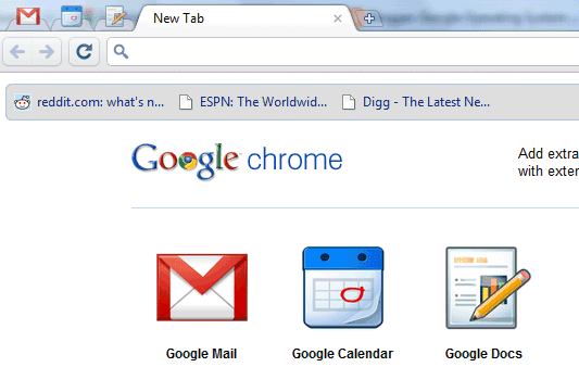

To install a web app, you need to write a small Chrome extension that includes one or more icons, the URLs used by the applications and the permissions that are required.

Chrome already includes extensions for 3 popular Google services and here's how to add them:

1. Make sure you use Chrome Dev Channel 6 or a recent Chromium build.

2. Edit Chrome's desktop shortcut and add a command-line flag. In Windows, right-click on the shortcut, select "Properties", append a space followed by --enable-apps in the Target field and restart Chrome.

3. Open Chrome, go to chrome://extensions and click on "Developer mode".

4. Click on "load unpacked extension" and navigate to Chrome's resources folder. Here's the location of the folder in Windows:

%USERPROFILE%\AppData\Local\Google\Chrome\Application\[Version]\resources (Vista, Windows 7)
%USERPROFILE%\Local Settings\Application Data\Google\Chrome\Application\[Version] \resources (Windows XP)

5. Click on one of the three folders: gmail_app, calendar_app, docs_app and repeat the steps 4-5 for the other two folders.

6. To add the applications to the tabstrip, you need to click on the icons from the new tab page.
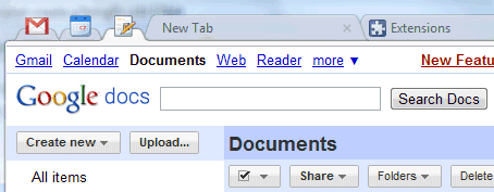


Web apps are added to the new tab page, they use special pinned tabs that no longer include the Omnibox and the Gmail app has an option for desktop notifications, which doesn't seem to be enabled.

"Once installed, a web app gets a big icon in Google Chrome's app launcher area, as well as some integration with the host OS. When running, an installed web app has a special frame and other UI enhancements to make the web app easier to distinguish from other web content. This special treatment makes running apps easier to find and prevents accidentally opening multiple copies of them."

Google will launch a Chrome Web Store for web apps, where you'll be able to find an install other applications. Until then, you can create extensions for your favorite web apps.

Google Tests Multiple Accounts Sign in

Google tests a feature that allows you to sign in to multiple Google accounts in the same browser. Multiple sign-in only works for Gmail, Google Calendar, Google Reader, Google Docs, Google Sites and Google Code, but it's likely that other Google services will be added when this feature will be publicly available.

If you use a service that doesn't support multiple sign-in, it will default to the first account that you signed in using your browser. Google suggests to use a different browser, but you can also use Chrome's incognito mode to sign in to an additional Google account.

Another limitation is that Gmail's offline mode is disabled if you turn on multiple sign-in.


Multiple sign-in will let you open Gmail in multiple tabs, log in using different accounts and read the messages from all your accounts without opening another browser. Right now, you have to log out before logging in to a different account.

Tuesday, July 13, 2010

Picasa Web Integrates with Picnik

Picasa Web Albums added an option that lets you edit photos in Picnik, the online photo editor acquired by Google in March. After clicking on the "Edit" button, Picasa Web Albums uploads the photo to Picnik and opens Picnik in a pop-up box.

Picnik is still a Flash application and it doesn't load quickly, so you have to wait at least 10 seconds until you can use it. The online photo editor doesn't have all the features that are available in Picasa, but there's an useful "auto-fix" option similar to the "I'm feeling lucky" button from Picasa, you can crop photos, repair red-eye flaws, remove color casts automatically and fix exposure.


The nice thing is that you no longer have to sign in to Picnik and that the changes can be saved to Picasa Web Albums after you click "save to my album", but that's nothing new. Flickr has been offering a similar feature since 2007.

"Picnik's rich editing tools are now integrated into Picasa Web Albums allowing you to experience them without ever having to leave your account. As long as you're using Picasa in one of the Picnik supported languages, just click 'edit' from the edit drop down menu or from the new handy Picnik icon. Then, Picnik away by applying an effect, adding a sticker, or exploring your own creative path with advanced tools. When you are done editing your photo, save back to your album by either replacing the existing image or making a new copy," suggests Google.

I expect that Picnik will be rewritten as an HTML5 application, so that it can have a better performance and properly integrate with Picasa Web Albums. Instead of opening the editor in separate box, Picasa Web Albums should let you edit the photo in place.

{ Thanks, Sterling and Niranjan. }

Monday, July 12, 2010

App Inventor for Android

App Inventor is a Google software that allows anyone to develop simple Android apps. "To use App Inventor, you do not need to be a developer. App Inventor requires NO programming knowledge. This is because instead of writing code, you visually design the way the app looks and use blocks to specify the app's behavior."

App Inventor lets you create applications that use advanced features like GPS or sending SMS messages. "You can build an app to help you remember where you parked your car, an app that shows the location of your friends or colleagues at a concert or conference, or your own custom tour app of your school, workplace, or a museum."

Google says that the software has been successfully tested in several schools across the US. "App Inventor for Android gives everyone, regardless of programming experience, the opportunity to control and reshape their communication experience. We've observed people take pride in becoming creators of mobile technology and not just consumers of it," says Google's Mark Friedman.

You need an invitation to try App Inventor, but you can complete this form to get an invitation.


"The App Inventor project is led by MIT computer scientist Harold Abelson, the founding director of the Free Software Foundation, Public Knowledge, and the Creative Commons who's now on sabbatical at Google," reports the Register.

"The Google project, Mr. Abelson said, is intended to give users, especially young people, a simple tool to let them tinker with smartphone software, much as people have done with computers. Over the years, he noted, simplified programming tools like Basic, Logo and Scratch have opened the door to innovations of all kinds. Microsoft's first product, for example, was a version of Basic, pared down to run on personal computers. The Google application tool for Android enables people to drag and drop blocks of code — shown as graphic images and representing different smartphone capabilities — and put them together, similar to snapping together Lego blocks. The result is an application on that person's smartphone," notes the New York Times.

App Inventor is especially suitable for Android because Android apps are collections of reusable intents. Even if you build a simple application, you can easily make it more powerful by using components from other applications.


{ Thanks, Kevin. }

Google Suggest as a Context-Sensitive Spell Checker

This is one of the most useful features released by Google this year. Google Suggest, which usually auto-completes your query as you type, is now also a spell-checker. Even if Google can't find popular queries that start with the words you've typed, it will still show a "did you mean" entry that corrects your spelling mistakes.

The most impressive thing about this feature is that the spell checker is context-sensitive, so the suggestions are actually relevant. It's likely that Google uses the smart spell checker from Google Wave.

If you type [this is a rlly], Google suggests that [this is a rally] is more appropriate. Most browsers offer the same suggestion. If you type another word and your query is [this is a rlly beautiful], Google shows a different suggestion: [this is a really beautiful].


Type [Why its so important too eat hole grains] in a text field from a web page and your browser won't find any spelling mistakes. Not even Gmail's spell checker can find the mistakes. That's because most applications use dictionaries to find the words that are spelled incorrectly. Google Suggest is smarter because it tries to find if the words make sense in the context of your query.

Sunday, July 11, 2010

Google's Anagram Easter Egg

Search for [anagram] using Google and you'll notice a weird suggestion: "Did you mean: nag a ram". Obviously, "nag a ram" is an anagram of the word "anagram".

"An anagram is a type of word play, the result of rearranging the letters of a word or phrase to produce a new word or phrase, using all the original letters exactly once," according to Wikipedia.

Google can't find the anagrams of a word, but you can use WolframAlpha to find them.


This is not the first Google Easter egg that helps you understand a query: [ASCII art] and [recursion] are two other examples.

{ Thanks, Arpit. }

Saturday, July 10, 2010

Google's Stats About the Web

Google has recently published a report about the Web, which includes a lot of interesting stats. The results were obtained from a sample of 4.2 billion web pages indexed by Google.

"The average web page takes up 320 KB on the wire (Google took into account the embedded resources such as images, scripts and stylesheets). Only two-thirds of the compressible material on a page is actually compressed. In 80% of pages, 10 or more resources are loaded from a single host."

The average number of images per page is 29.39 and the average size of all the images from a page is 205.99 KB. A web page includes an average of 7.09 external scripts and 3.22 external stylesheets. The average size of the scripts is 57.98 KB and the size of the stylesheets is 18.72 KB. Google also found that only 17 million pages from the sample use SSL (about 0.4%).

Urs Hölzle, Google's Senior Vice President of Operation, said that the average web page takes 4.9 seconds to load and it makes 44 calls to different resources. "Speed matters. The average web page isn't just big, it's complicated. Web pages aren't just HTML. A web page is a big ensemble of things, some of which must load serially," said Urs Hölzle.

Google offers a lot of tutorials that help web developers improve the performance of their websites. Google advises to use Gzip compression, use HTTP caching, optimize JavaScript code and properly combine scripts and stylesheets.

Friday, July 9, 2010

Shorter Google Maps URLs

Google Maps URLs are very long because they include a lot of parameters. They're way too long to be added to a Twitter message, a news article or a banner.

To solve this problem, Google Maps Labs added a feature called "short URLs" that shows short permalinks when you click on "Link". The nice thing about this feature is that it uses Google's URL shortening service, which is very fast, and URLs are more descriptive because they include "goo.gl" and "maps".


To get the full permalink, you need to right-click on "Link" and copy the location. Unfortunately, Google removes the embedding feature if you enable "short URLs". Maybe it would make more sense to show the short URL as an additional option.

YouTube Plays 4K Videos

YouTube added support for playing videos that are bigger than 1080p. "Today at the VidCon 2010 conference, we announced support for videos shot in 4K (a reference resolution of 4096 x 3072), meaning that now we support original video resolution from 360p all the way up to 4096p. To give some perspective on the size of 4K, the ideal screen size for a 4K video is 25 feet; IMAX movies are projected through two 2k resolution projectors," explains YouTube.

There aren't many 4K videos uploaded to YouTube, but you can find some examples in this playlist. To switch to 4K, select "original" from the list of versions that are available. YouTube says that you need an "ultra-fast high-speed broadband connection" and it's probably a good idea to play the videos in fullscreen on a big-screen TV.


For now, the support for 4K videos doesn't mean too much, but it's nice to see YouTube pushing technological boundaries.

New Format for Google's Definition Results

Three months ago, I found some Google search shortcuts that trigger results from Google Dictionary and Google Translate. The keywords for Google Translate no longer work, but you can still add "en:en" before an English word to see the definition from Google Dictionary.

Google's results now include links to Wikipedia, Dictionary.com, Merriam-Webster and Answers.com. Two of these sites (Dictionary.com and Answers.com) have been previously used to show definitions for each word of a query. They have been replaced by Google Dictionary and the feature has been removed when Google launched a new interface, two months ago.

Here's an example of query that triggers the special definition results: [en:en overcast].


Google has another special result that's displayed if you search for [define word] or [word definition]. This time, Google shows definitions from WordNet.


There's also a define: operator that shows definitions from WordNet, Wikipedia, glossaries and other web pages.

Gmail Adds Rich Text Signatures

Gmail added one of the most frequently requested features: rich text signatures. If you go to the settings page, you can edit your signature and change text formatting, add links and images. You can only create a rich text signature if you enable rich formatting in the "compose mail" page.

"Some of you have tried your own solutions, including Greasemonkey scripts, browser plugins, and even using canned responses from Gmail Labs. Others have simply lived with frustration of not being able to change the colors or font size of your signature, or insert images and links. Either way, you'll be happy to know that today we're launching the ability to write your own rich text signatures right in Gmail," says Mark Knichel, from Google.


Another useful new feature lets you create distinct signatures for the email accounts you're using when sending messages. If you send mail from different addresses, it makes sense to have a distinct signature for each account.


Unfortunately, the new features only work in the desktop standard Web interface. "Currently, only the latest desktop version of Gmail supports rich text signatures and multiple signatures. The older version and HTML version of Gmail, along with the mobile versions, use a plain text version of your primary account's signature."

{ Thanks, Sterling. }

Thursday, July 8, 2010

YouTube Leanback

YouTube released a preview of the Google TV interface: it's called YouTube Leanback. "YouTube Leanback is all about letting you sit back, relax and be entertained. Videos tailored to your interests play as soon as you visit the site and they play in full screen and high definition, continuously. There's no need to click, search, or browse, unless you want to, of course. Watching YouTube becomes as easy as watching TV," suggests YouTube's blog.

By default, YouTube plays videos from your subscriptions, but you can also select a category to play popular comedy videos, short films, music videos, news, travel videos and more. The interface doesn't work with a mouse, as you can only use the arrow keys and Enter to skip a video, select a category, search, pause or resume a video. YouTube Leanback will work well with Google TV's remote control, but you can also install an application like Air Mouse on your mobile phone.


Leanback is not the first YouTube interface designed for TVs: there's also YouTube XL, but the interface isn't fluid and there are too many options that get in the way.

Better YouTube Mobile

Google's services have a big advantage: a lot of mobile phones include applications for services like YouTube, Google Maps, Gmail, Google Search. Unfortunately, the native applications are rarely updated, so users miss the new features added to Google's services.

A good example is the YouTube application for iPhone, developed by Apple, which still uses 5-star ratings, doesn't support captions, annotations or search suggestions and offers a single sharing option: email. Google's YouTube application for Android is not much better, even if it's updated faster.

Web applications evolve faster, as they aren't updated only when a new version of iOS or Android is released. The latest update of the YouTube Mobile site shows that a web application can be almost as good as a native application, even when you're talking about a mobile phone.


"We launched YouTube on mobile devices in 2007 with about 1,000 videos available on the mobile site (m.youtube.com). While this suddenly opened up the possibility to access videos on the go, our site, mobile browsers and the hardware had limitations that prevented the mobile experience from keeping up with YouTube on the desktop. Today, more than ever, we know that you want to be able to find and access your favorite videos wherever you are. That's why we're rolling out an updated version of the mobile site," explains YouTube's blog.

The latest update adds features like search suggestions, replaces ratings with like/dislike buttons, adds the option to create playlists and to watch a high-quality version of a video even if you don't use WiFi. The site loads faster and it's easier to use on a touchscreen. "As we make improvements to Youtube.com, you’ll see them quickly follow on our mobile site, unlike native apps which are not updated as frequently."


YouTube Mobile can be accessed by visiting m.youtube.com on your phone. The new version only works if you have an iPhone or an Android phone and it's only available in English.

Sunday, July 4, 2010

Google Shows Related Videos

Google started to add links to related videos for search results from sites like eHow, Howcast, GameTrailers or Hulu. Google shows two additional videos from the same site below the main search result.


It's not the first time when Google tries to make the content of a site more discoverable. Google already shows sitelinks that highlight popular pages from a site, search boxes for site search, navigation breadcrumbs, related topics from discussion boards.

{ via Blogoscoped Forum }

Google Phrase Search Trick No Longer Works

One of the most popular advanced search feature is phrase search. Google and other search engines let you find web pages that include the exact phrase you type. "By putting double quotes around a set of words, you are telling Google to consider the exact words in that exact order without any change," mentions Google's help center.

The nice thing about phrase search was that you didn't have to close the quotes. You could type ["Dual Polarization Antenna] and Google assumed that you forgot to close the quotes. This was especially useful if you changed your query by adding new words or if you typed the query using a virtual keyboard.

Unfortunately, the trick no longer works and you now have to close the quotes to use phrase search:


At some point, you could even enter queries like [Dual-Polarization-Antenna] and Google returned the same results as if you typed ["Dual Polarization Antenna"].

When Google Doesn't Return the Most Relevant Results

A Google employee has recently said that search engines have improved so much that people are surprised when they don't get good results. When Google has been launched, users were really surprised to see relevant results, even if they were much poorer than they are today.

When you search for [iPod], you expect that the first result is iPod's homepage. Google returns a different page (iTunes homepage) and doesn't even include the iPod homepage in the list of the top 10 search results.


Bing and Yahoo Search return much better results: iPod's homepage is the top result in Bing and the second result in Yahoo Search.


The most likely explanation why Google doesn't return the most relevant results is that apple.com/ipod used to redirect to apple.com/itunes, as you can see if you check Internet Archive. The most recent version of the page cached by the Internet Archive is from October 2009 and it still redirected to the iTunes homepage.