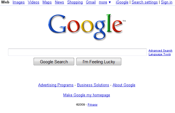
"Internally, a large number of Google employees have been using the new homepage. They have come to really like it — it represents our focus on great search yet helps searchers efficiently access all of Google's products. Like the new supersized search box we launched several months ago, this change is one that is very noticeable at first, and then quickly becomes second nature," explains Google's blog.


I rarely go to Google's homepage to search the Web, since browsers include a search box and I don't have to load a new web page to enter a query. The latest UI changes will make me visit Google's homepage more often: the search box is bigger, the search results are loaded without opening a new page using Ajax and the new clutter-free interface helps you concentrate.
No comments:
Post a Comment