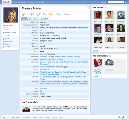
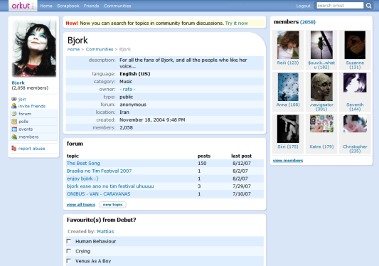
orkut has recently changed the homepage and will launch a revamped interface in the weeks to come. "The change isn't live yet, but starting soon, we will start rolling-out the new look. To start, we will roll it out to a small group of users randomly selected, and will continue to do so until everyone is on the new site."
If you don't see the new interface yet, here's how it looks like: colors are warmer, orkut has rounded corners, the new icons are lovely and there are even touches of AJAX. The conclusion: orkut is not ugly anymore.


No comments:
Post a Comment