So why aren't customers satisfied with Google? "The average consumer that goes to Google today doesn't see anything different than from three years ago," thinks Larry Freed, president of Foresee Results, and he's right. Google's sparse homepage continues to stand out from the rest of the crowd and it has a lot of admirers: it loads fast, it shows exactly what you want (a search box) and it's not intimidating.
But Google users have many opportunities to find out about Google products: from the new menu bar to the OneBox results, from the extended snippets to Google Toolbar, from the personalized homepage to the impressive press coverage Google gets. For example, you can discover Google Docs in many ways: you may see a link next to a Gmail attachment, receive an invitation to collaborate on a document, click on the link from Google's homepage or find an option in Google Toolbar. People should discover a product naturally.
Google's main problem is to make people realize that it's more than a search engine and that could be solved by packaging all its non-search services in Google Apps, integrating them and distributing them as a suite of online communication tools.
"Google falls by 4% from a year ago to a score of 78. Its year-to-date stock returns have been about market average - a far cry from the explosive growth after going public in 2004. Google also missed its most recent earnings forecast. For a company that has introduced so many new products and made so many changes, it may be surprising that its homepage has changed so little. It is almost the same as it was in the 1990s. Some users say it looks stale compared to Ask.com, which has a very different display of search results," says Professor Claes Fornell from the University of Michigan.
And here's a nice quote from a 2002 interview with Google's Marissa Mayer:

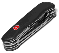
I think Google should be like a Swiss Army knife: clean, simple, the tool you want to take everywhere. When you need a certain tool, you can pull these lovely doodads out of it and get what you want. So on Google, rather than showing you upfront that we can do all these things, we give you tips to encourage you to do things these ways. We get you to put your query in the search field, rather than have all these links up front. That's worked well for us. Like when you see a knife with all 681 functions opened up, you're terrified. That's how other sites are - you're scared to use them. Google has that same level of complexity, but we have a simple and functional interface on it, like the Swiss Army knife closed.
Google's difficult task is to make people aware of the tools that are available in the Swiss Army Knife.
{ The image, which shows a Victorinox Swiss Army Knife, is licensed as Creative Commons by Martin. }
No comments:
Post a Comment