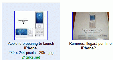
I like the change, because the most important factor when you decide if an image result is good enough is the thumbnail, not the source of the image or its format. If you want a certain format (JPEG/GIF/PNG) or only big images, you can always use the advanced search.
This new design, heavily inspired by Windows Live Search, uses JavaScript, so if you disable JavaScript in your browser, you'll get the old version.

Updating with some comments from an older post:
- The "classic" Google Images results are far better, show more information in a quick glance, and you don't have to mouse over each image individually. (cenoxo)
- Part of doing an effective web search is the searcher's own experience in quickly seeing at a glance the most likely result for what we are looking for. Removing information (and there's no real excuse for this here, it doesn't create any more real estate for extra images, just hides the info in a white space until you mouse over) that can help in this regard is a backward step in functionality. I definitely suggest having the option to use the tried and true or the new and unfathomable... (Anonymous)
Update (February 21): Google put the old design back.
No comments:
Post a Comment