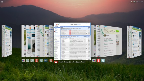
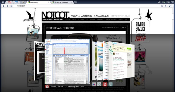
Chrome OS uses an interesting visualization for tab overview. "The overview is available via either gesture and hotkey. It provides a visual way of switching between windows and tabs. Windows are exploded into the tabs they contain, and all tabs/windows are visible in a single 2.5d space. This model is largely based on Peter Jin Hong & Elin Pedersen's G.L.I.D.E. Tab Navigation. We present tabs in a venetian blind arrangement, ensuring visibility of the top left of every page, and using perspective to compress the most useful portions of the page into the available strips. Favicons are presented as an alternative visual aid."
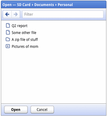
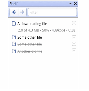
Google also posted some screenshots of the open/save dialogs and the download shelf panel. "The shelf is an on demand target for downloading and uploading. It acts as a temporary resting place for files that have been accessed, and for content being uploaded to websites."
Even if the Chrome OS only lets you use a browser, you can still download files and open them using Chrome's multimedia libraries or using web applications like Google Docs.
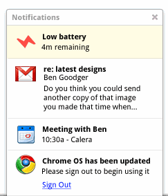
A notification panel will be used for OS and website notifications, so web applications will be able to add their own alerts.
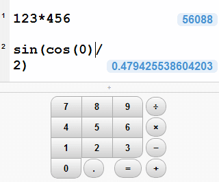
Chrome OS will also include simple applications like a calculator:
{ via TechCrunch }
No comments:
Post a Comment