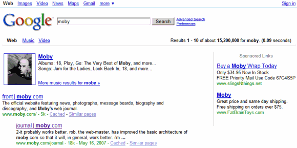
Google's logo has vibrant colors, the search box is bigger and it now includes the search button, the links from the homepage are no longer underlined.

Google's search results pages include a persistent sidebar that suggests specialized search engines, advanced filters and related searches. By default, Google only shows suggestions that are relevant to your query, but you can click on "more" to see other ways to refine the results.

"Today's metamorphosis responds to the increasing richness of the web and the increasing power of search — revealing search tools on the left and updating the visual look and feel throughout. The top section of the new left-hand panel builds on Universal Search by suggesting the most relevant genres of results for your query and letting you seamlessly switch to these different types of results. Our expandable Search Options panel launched last spring brought many rich slice-and-dice tools to search. The new left-hand navigation showcases these tools and enables you to get a different view of your results. In addition to the left-hand side changes, we've updated our look and feel in terms of our color palette and our logo. These changes are slight, keeping our page minimalist and whimsical, but make our overall look more modern," explains Marissa Mayer.
Some of the features aren't completely new: when Google launched Universal Search in 2007, an important new feature was that Google suggested relevant specialized search engines. The suggestion bar has been removed after a couple of months and now it's back as a vertical panel.

Ask.com pioneered the persistent left sidebar in 2007, and now both Bing and Yahoo Search use it. Google adopted a similar layout to make search interfaces more consistent. "I don't like jazz, because you never know what's going to happen next," said Google's Marissa Mayer. "I've been calling this problem 'user interface jazz.' This result looks this way, and that result looks that way [something much different], and it really does slow you down."
When you navigate from web search to Google Books search, from image search to Google News, the interface will be consistent and you may not even realize that you're using a different search engine.

Sometimes, Google's sidebar will also include a list of suggestions that are difficult to define. Google calls them "something different" and used to show this label: "not entirely unlike". They're actually similar queries generated using Google Squared:

No comments:
Post a Comment