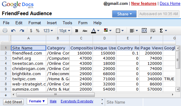
"We were hoping to accomplish three things with it: make it faster, make it more consistent with our siblings (documents and presentations), and give us more room to add features without clutter," explains Google.
The toolbar includes some of the most frequently used features, but I don't think Google did a job at ordering them: for example, the cell formatting options are too prominent, while pasting and sorting have been neglected. It's great that the formulas can be added without switching to a different tab and you can share the spreadsheet without opening a new page. The most stylish UI element is the chat box that can be loaded by clicking on "(name) is viewing...".

If you don't remember the previous interface, here's a screenshot:

A very cool new feature is the full-screen mode: press Ctrl+Shift+F repeatedly to alternate between two full-screen views and the standard view. The same shortcut lets you switch to the full-screen mode in the word processor, but you need to press Esc to return to the normal mode. Where is the consistency?
{ Thanks, Kevin. }
No comments:
Post a Comment