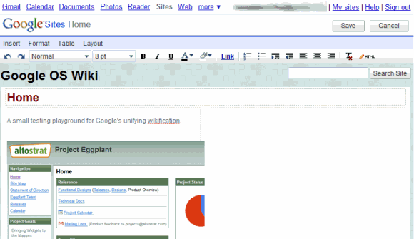
Google Sites has been added to the navigational menu, next to Gmail, Google Docs and Google Reader, so you no longer have to click on "More" to switch from Google Docs to Google Sites. Other changes are more subtle: hierarchical navigation, the sections are more customizable and there's a new "Pages" view that lists all the pages, information about their creator and the number of revisions.
"We switched the site settings area to use vertical navigation, to make room for some upcoming features like AdSense integration. We've also started to add some collaborator tools to the site management area. Less visibly, we made some major changes to our rendering infrastructure to improve performance and in preparation for new upcoming themes. This is meant to remain compatible with the layout customizations site owners have made, but it might have minor impacts on how your site looks."
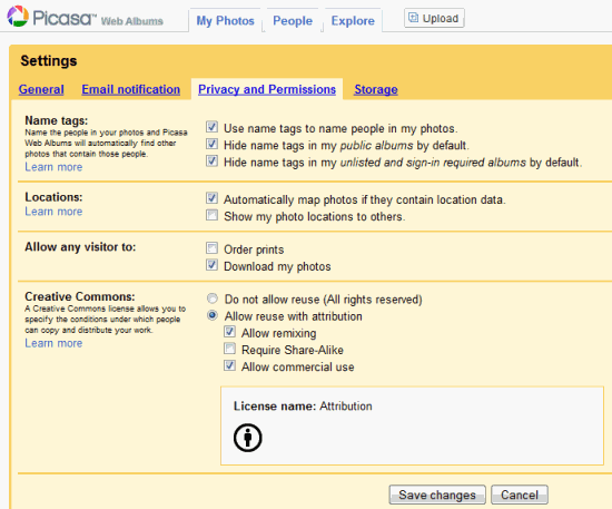
Speaking of consistency, Picasa Web Albums' settings page has a new design similar to the one from Gmail, Google Calendar, Google Docs and Google Reader.

In the 2008 Founders' Letter, Sergey Brin wrote: "There are a number of things we could improve about these web services. For example, since they have arisen from different groups and acquisitions, there is less uniformity across them than there should be. For example, they can have different sharing models and chat capabilities. We are working to shift all of our applications to a common infrastructure. I believe we will achieve this soon, creating greater uniformity and capability across all of them."
{ Thanks, Stefano. }
No comments:
Post a Comment