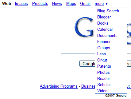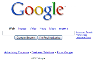
Google's current navigation bar was added in May as a solution for the growing list of Google products that lacked visibility and were difficult to find. The bar added a drop-down that includes less popular services like Reader and Patent Search, while replacing the famous More page. It was placed at the top of the page, detaching it from the search box, as you can see in the screenshot below.

Google's bar has two configurations that depend on the context:
* a search mode (visible in most services and on the homepage) - shows the most important search services
* an apps mode (you can see it in Gmail, Calendar, Docs, Picasa Web and Groups) - shows the most popular web apps for communication and collaboration
Because the space is limited, Google can't afford to include too many links, so here's the structure of a bar:
- 5 links that point to the most important services of the current mode (search or apps). If the active service is included among those services, the link is replaced with a bold text.
- a transitional link to the most popular service of the inactive configuration (Web search or Gmail).
- a drop-down that lists the other 14 services alphabetically.
If the services don't have descriptive names, the bar includes alternative titles: "Photos" for Picasa Web Albums and "Documents" for Google Docs.
It's interesting to note that Google includes 11 search services, 8 apps and Google Labs (it's not clear whether Google Groups is more important for search or for its community features).
While Google's selection is mostly based on the popularity of its services, users may want to see different configurations. Let's say my favorite Google services are: Blog search, Scholar, Blogger, Google Reader, YouTube and Google Project Hosting. That means I always have to click on the "more" link or even to search for YouTube and Project Hosting, because they're not included.
What I'd like to see is an option to choose the services that are displayed in the navigation bar and a task-oriented search box that will look like the Quick Search Box from Google Desktop and is already partially implemented at Google Code. The search box should have auto-complete and should let you search for product names, descriptions and important tasks for each service. For example, you could enter: [compose mail] or [contacts] for Gmail, [create event] or [agenda] for Calendar, [upload document] for Google Docs, [referrals] or [stats] for Analytics etc. The results should prioritize the services you used the most and Google should send you directly to the right page (Gmail's contact page, for example).
To facilitate the discovery of features, the task-based search box could be added to each service and act as a humanized command line that doesn't require you to know parameters and command names.

No comments:
Post a Comment