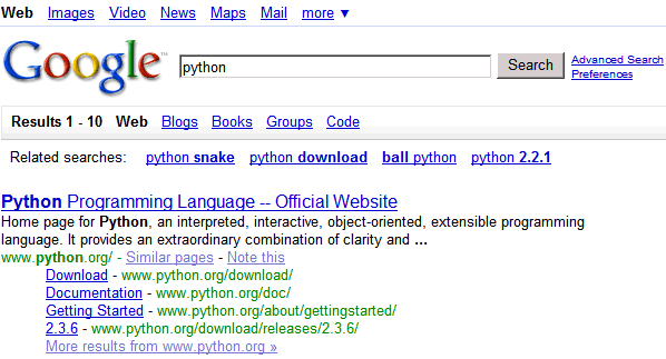
Courtesy of Webbsnack, here's how you can test this new design.
Copy this code:
javascript:document.cookie= "PREF=ID=fddb01133a87d314:LD=en:CR=2:TM=1177334998:LM=1177334998:GM=1:S=OOg0FEVzpPplxe9J; path=/; domain=.google.com";void(0);
go to google.com/ncr, paste it in the address bar, press enter, then search for something clever. I absolutely love the new design, but if you don't like it, clear your Google cookie and it'll go away.

Small observation: the number of results should be at the top of the page. I sometimes search for things on Google just to see the number of results (this is my primitive grammar checker).
Update: There's an alternative version for this new layout.

The code for the second design (via Blogoscoped):
javascript:document.cookie= "PREF=ID=9d04e374b01fd77c:TM=1177187296:LM=1178229339:DV=AA:GM=1:IG=3:S=Iiqx5SsQA0p79zvy; path=/; domain=.google.com";void(0);
No comments:
Post a Comment