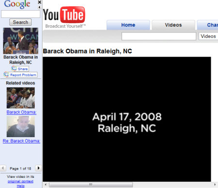
The video watch page has also been redesigned and it's more flexible: you can hide the right sidebar, minimize the list of related videos and use pagination to read a long list of comments.

Videos from third-party online video sites are still displayed in an annoying frame, but Google Video's bar has been moved at the left of the page to leave more room for the videos.

The search page has two new options for displaying results: in a grid and in TV view, that lets you watch videos while also being able to see the list of results. An interesting new option in the advanced search page lets you search only closed captioned videos. Another good thing is that you can now watch videos inline for some new video sites: DailyMotion, Revver, Guba, Crackle, not just for YouTube and Google Video.

The updates make Google Video more user-friendly and easier to use, even if mixing a video search engine with a video hosting site makes the user experience confusing.
No comments:
Post a Comment