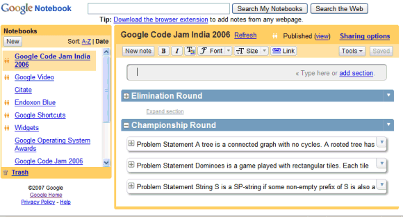
Google Notebook has a new UI that uses AJAX a lot (here's the old one, for reference). "After a long slog, our sexy new version of Google Notebook is out. There are still bugs and things missing, but I think this version is a lot more fun than the old one," says Kushal Dave on his blog.
You can see all your notebooks in the sidebar, ordered alphabetically or by modified date. It's easier to add notes: just click in the space between any existing notes. Google Notebook borrowed the layout of messages from Gmail and placed the editing buttons at the top of the page so you don't feel any disruptive interface change when you edit a note. You can now add comments to notebooks and remove the title and the URL of a clipped note. Google auto-saves each note, so you don't have to press a "Save" button.
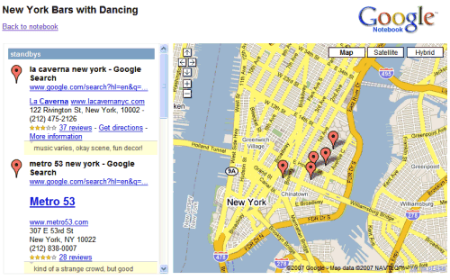
If you add notes from Google Maps and publish the notebook, you'll have an option to see the places on a map.

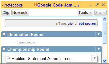
The mini-notebook, available as an add-on/extension, has a similar look:

The option to search public notebooks has been removed (but you can use Google search to do that), Google Notebook looks faster because of the heavy AJAX usage, and the product graduated from Google Labs. Overall, a nice face-lifting, even though users were expecting to see other features like tags or file attachments.
{ Thanks, C. I. R. E. }
No comments:
Post a Comment